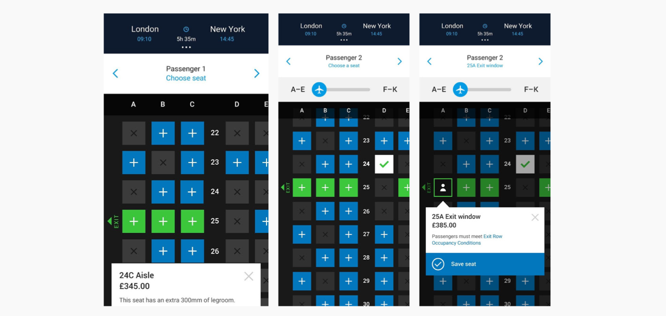
British Airways Selling Flow Redesign
British Airways
Ba.com needed to be modernised
The old selling flow was in need of a redesign to bring it up-to-date while remaining accessible.
The team + my role
UX Designer | My cross-functional, agile team comprised a product owner, a scrum master, a business analyst, 2 developers and a UX designer. I facilitated stakeholder workshops, created wireframes and prototypes for user research and high fidelity mockups to handover to developers.
The challenge
Create modern and accessible user journeys within the technical limitations and budget. Ensure that the ancillary journeys that would feel like a cohesive experience when completed within the full ba.com selling flow.
The process and deliverables
Stakeholder workshops
Facilitated workshops to understand the business goals and what the metrics were for choosing seating and paying for flights with Avios, British Airways’ air miles program.
User journey mapping
Used sketching and experience maps to understand and document the user journeys.
My sketches of new ideas for the ba.com seating flow.
Wireframing + prototyping
Created iterative wireframes and prototypes to test the concepts then usability of the new designs compared with the existing site.
Early wireframes of what the ba.com seating journey and interactions could be.


